
BY | SMALL BUSINESS
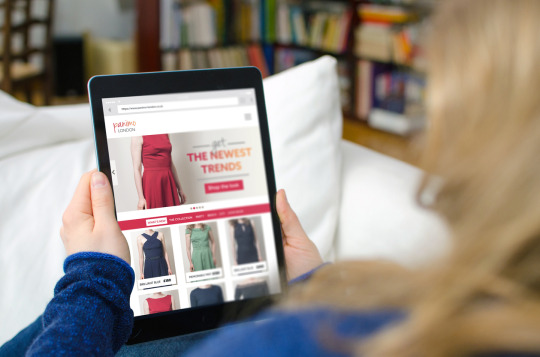
If ever the old saying “You only get one chance to make a good first impression” was relevant, it’s in ecommerce. Online shoppers are judgmental regarding the look of a website; and they should be! Site design offers important clues about the veracity of a seller. Thus, the best ecommerce platform will always consider design.
Beauty Is More Than Skin Deep
You can have the most wondrous products ever created. But if you can’t get shoppers to stomach looking at your site for more than 50 milliseconds, they will never know. Studies have shown this is the amount of time it takes for a user to decide if they like a website. This determination is based on a number of factors.
Chief among them are:
- 1. Colors
- 2. Symmetry
- 3. Type Style
- 4. Amount of Copy
You’ll have an excellent chance of holding a user’s attention if you focus your design choices around those elements.
Smart Color Choices
Color and emotional response are closely related. For example, red attracts attention, generates excitement, and is symbolic of love, warmth, life, and blood. Green triggers thoughts of balance, action, good taste, health, money and harmony. Blue signifies honesty, quality, competence, loyalty, trust, and reliability.
Deeply saturated colors imply wealth and sophistication, while bright and simple colors are often related to children. Pastels tend to appeal to women, while darker colors attract men. Making color choices based upon the characteristics of your primary audience will increase the appeal of your site. You can seldom go wrong with white for backgrounds. Products and black type stand out well against it. That said, you can also make a powerful statement with white text and colorful images on a black background. Whatever you do though, avoid employing more than three main colors in your design.
Harmonious Arrangement of Elements
An organized design pleases the eye. Arranging elements on a page so viewers are led in a logical fashion soothes them. Further, thoughtful menu design improves navigability. Checkout buttons, search functions, calls to action and shopping carts should be readily visible and in accord with the overall design. Meanwhile, crisp logos, photography and familiar social icons infer professionalism.
Easily Discernible Type Styles
Rendering body copy in a simple, easily decipherable font is paramount to your success. It’s OK to go frilly with your name or logo, but product descriptions should be easy on the eyes. People will not struggle to read them. Instead, they will move on to a more accommodating site.
Optimal Copy Density
A delicate balance must be struck here. You want to supply enough information to answer questions. However, you have to avoid paralyzing the reader with too much. A good way to approach this is to provide strong bullet points on the product’s landing page. Include a call to action button, along with the option to click to a product page with in-depth information. This satisfies the customer who wants to make the purchase right away; while providing an option for more information for the customer doing research.
Smart design decisions such as these will keep users on your site longer, inspire trust and lead them to convert. Building a better shopping site is easy if you use the best ecommerce platform.
Happily, the best ecommerce platform templates, such as those by Yahoo Small Business already take these details into consideration. Check them out today!


No comments:
Post a Comment